User Experience (UX) is the overall experience of an individual, or user, when interacting with a product or service. While UX is frequently thought of as exclusively related to digital products such as websites or mobile applications, it actually pertains to all touchpoints for a user including telephone, in-person, or mail experiences. In the context of government programs and services, this means that every interaction with the public represents a chance to enhance the user experience to improve outcomes.
Davis Pier helps incorporate UX best practices into the offerings of a number of organizations focused on delivering social programs and services. Research has found that improving UX for your product or service can improve uptake by 400%.
Our latest white paper, Transform Government Using UX dives into five UX trends impacting government and four steps to UX transformation.
Key insights for bringing UX approaches to social services:
1. Be clear and manage expectations
Applying for a social service or program can often be a stressful experience, so this is an important stage to try and relieve stress for the individual. People need to know how long they should expect to wait before they will hear from your organization. Otherwise, they may be left wondering if they are even eligible for the service or program offered. Designing opportunities for comfort and reassurance in the experience can go a long way.
We recently observed this while testing a new social service application tool. We observed users responded positively to the inclusion of a landing page that not only confirmed their submission and informed them of the next steps in the process but praised them for taking this first step.
This additional content may seem like a minor or unnecessary detail when designing a program or service, but considering the user’s frame of mind as they experience your offering can allow you to build in opportunities to be clear to users and provide reassurance.
2. Avoid legalese and jargon
Does your privacy policy use a lot of legalese or jargon, or does it clearly state how personal data will be collected, used, stored, maintained, and disposed of? One insight we gained through our research is that marginalized groups often experience mistrust of government programs and services as a result of years of oppression and discrimination.
During our review and subsequent redesign of a social service application tool we were able to see the difference in how users respond to complex language. The application required detailed personal information of applicants, including household composition, assets, and financial needs. One component of the application requested information on dependents.
In terms of basic language, “dependents” is not a common term used every day and runs the risk of alienating people with lower literacy. As the term dependent in this context means someone who relies on another person for support, the application form is likely asking for information on children or other relatives that may live with the applicant and rely on them for support. Swapping out the term “dependent” in favour of plain language phrasing such as “children or others in the home who depend on you for support” can ensure the applicant maintains their confidence when filling out that section.
Legalese and jargon can make people feel like the service or program is hiding something or is purposely excluding them. Plain language, in contrast, supports everyone’s understanding.
3. Prioritize accessibility
When updating a program or service, particularly one delivered through a digital channel, accessibility cannot be an afterthought.
Some high-priority items to ensure are present include:
Sufficient contrast
This focuses on the readability of text. Light-grey text on a white background may look chic, but it may fail to meet contrast requirements. You can use browser extensions to do a quick check if your design meets minimum contrast standards. 
Alternative text for images
Alternative text is also known as descriptive text and allows users who may be using a screen reader to understand images on a digital channel. This cannot be undervalued as it often contributes to ensuring everyone of all visual abilities has a similar experience when interacting with your site.
Maintaining a low number of links on a page
Where possible, combine similar links to reduce the number of redundant links on a page. Some users of screen readers prefer to listen to a full list of links on a page before deciding where to navigate. If your page has 50 or more links, this can be repetitive and frustrating to the listener.
After testing with people who self-identified as having an intellectual disability, we added new items to this list, including:
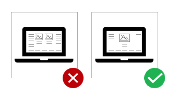
Reducing the volume of information on a page
This is a good practice for people of all abilities as information overload can impact how well someone understands and retains information. Keeping information basic, and provided as needed, can further support users to feel comfortable navigating a product or service.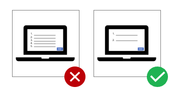
Clear labelling
A new trend for some digital sites is to rely more heavily on icons to convey information. While icons are not inherently bad, relying on icons without clear labels can be harmful to accessibility, particularly for those with Autism. For example, adding a small label that says “messages” below the envelope icon below is an easy way to address this. 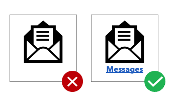
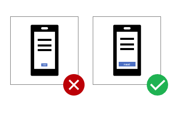
Increasing the size of touch targets to minimize user error
Touch targets are the boundaries of an action on a digital product. A clear example of this is any rectangular button you may see, such as a Submit button on a form. The larger the button, the easier it is to move your mouse to that space and correctly click. For people who may experience difficulty moving a mouse with precision, having a larger touch target can help reduce the likelihood of missing that button and therefore minimize errors.
4. Talk to people
Most mistakes in designing a social program or service arise from the false belief that you know best what people need. You may have some insights based on years of experience in the field or from having heard common issues that arise, but it can never replace talking to people directly about their experiences. The same goes for incorporating UX into a social program or service – you need to test your idea with the same people who will later use it.
We recently had the opportunity to redesign a service that supported individuals with various abilities to access recreational and vocational opportunities in their community. The original focus of this work aimed to engage current providers of activities to deliver specialized offerings for a new cohort of individuals.
After engaging with people directly impacted by this change, the project went in a new direction and focused on hearing from those who would be using the service to learn about changes they would like to see and how they would like to use the service. This drastically changed the outcome of this project, which now focuses on the individual’s choice in how they would like to spend their day with significantly more customization available. This outcome would not have been possible without engaging those impacted by this new service directly.
This is the best way to gain insights into what works and what doesn’t work for your idea. Doing this work before the product or service launches saves a lot of budget (and headaches) down the road, and can ultimately lead to better outcomes for those who use it.
Incorporating UX into government services is a significant, but important, undertaking. We must start by ensuring an individual’s experience interacting with a social program or service is a positive experience, particularly as this is often a vulnerable moment in their lives. Government is constantly working to improve crucial social services and increasingly incorporate UX at every step of the way.
We continue to support these transformations in government and know there is more learning ahead. We, for one, are excited for the future of UX in social programs and services.
If you are interested in learning more about key trends that can help to transform government using UX, click here to download our white paper.